This post is part show-and-tell, part reference doc for me while I maintain the site and write new articles.
I’ve always admired docs that are also the product — it’s always tickled me that man man is the canonical way to learn about man pages, or that Python’s doctest runs the docs’ examples to ensure they stay true through changes. This post is my take on that idea: every feature of the page that renders articles on this site will be demonstrated in this post. I even have an agent instruction to ensure that new features added to the site manifest themselves somewhere on this page!
I hope this gives you, the reader, get something hopefully approaching entertaining to read while I get a page I can refer back to when I forget how to invoke a particular feature. Win-win!
Explain the feature in prose, then make the prose use it.
A lot of the features here came out of research — I had an agent go and look at every personal blog and news site that had a top post on Hacker News in the past few weeks, and I drew from what I found. I should be honest that this is, at the end of the day, a feature list for the post page on my blog. But it’s a feature list that eats its own cooking, and adding a capability means updating the tour instead of leaving behind another undocumented option.
Preceding the Prose: Frontmatter#
Everything above this sentence came from frontmatter.
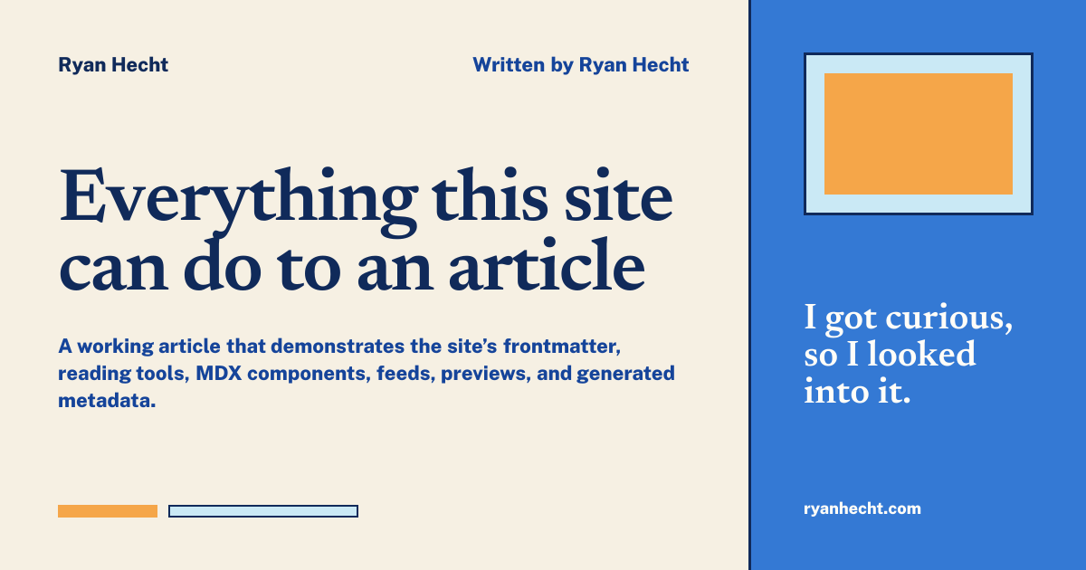
The title and description become the visible article heading, browser metadata, canonical description, Open Graph copy, Twitter-card copy, structured data, archive entry, RSS entry, and generated social image. The article opens with the title and premise before presenting its publication date, type, reading time, tags, and utilities as one quieter supporting group. The update date and last-reviewed date feed the freshness treatment above, and the update note says what actually changed rather than leaving a bare new timestamp.
Staleness is deliberately not part of that arithmetic. There is a separate stale flag I set by hand, because an article stops being trustworthy when something inside it stops being true — not on a date chosen by whoever wrote it. A reference page can be accurate for years, and a post can be wrong a week after publication; a countdown configured at authoring time gets both of those cases backwards. This page isn’t flagged, so the warning doesn’t appear.
Frontmatter is also punctuated like prose. Markdown bodies pass through a typographer that turns -- into an em dash and straight quotes into real ones, but a title, description, or summary never touches that pipeline — so the same shorthand, typed in the same file a few lines higher, used to arrive on the page as raw ASCII beside properly set body copy. Those fields now run through the same normaliser at the schema, which is why the description under the headline above reads with the same dashes and apostrophes as this paragraph. Nothing changes about how any of it is written.
The TL;DR is also frontmatter. It provides a stable, deliberately written summary instead of asking a template to guess which paragraph matters most.
Tags create archive routes and tag-specific RSS feeds. draft: false allows the page into the build, while preview: false tells the archive that this is a complete article instead of one of the early placeholder pieces.
One more frontmatter field is doing something you can see at the very top of this page. project: ryanhecht-com declares that this article is about a thing in the projects directory, which is why Project: ryanhecht.com sits above the title. The reference points this way — from the article to the project — because an article knows its subject the moment it’s written, whereas the alternative would mean editing a project file every time anything gets published. The project page collects the reference from the other side without being touched: ryanhecht.com lists this article under Writing about ryanhecht.com, and a parent project such as MCParks additionally rolls up anything filed against its sub-projects under a separately labelled From its parts group, so a visitor who came for the whole story gets it without the two kinds of writing being silently merged.
That band is not articles-only. Anything posted to another network can declare the same project reference, and a release note or a thread lands in the list beside this article in date order — which matters because shipping something is evidence a project is alive in a way that writing about it is not. The two are told apart by weight rather than by a badge, exactly as they are in the archive: an article gets its serif title and deck, while a syndicated post gets its network’s mark and its own words at interface size. It also means a project that has moved without being written about yet still has something honest to show.
Structure becomes navigation#
Second- and third-level headings automatically receive stable IDs, permalink anchors, and entries in the table of contents. Nothing in this file manually builds the rail.
On desktop, Contents remains fixed at the side of the article while the prose moves — inspired by how Wikipedia currently does it. Its (Top) link returns to the absolute top of the page, including the global menu, and as each heading crosses the reading line, its corresponding link becomes bold and receives an accessible current-location state. A post with no second- or third-level headings renders no Contents rail or orphaned accent bar.
The article header and prose share the same left edge; the back link occupies the contents column instead of pushing the title into an unrelated margin. The site navigation marks Posts as the current section. Beside the tags, compact permalink and RSS controls repeat the utilities available at the end of the article without turning them into another line of metadata.
This smaller heading proves the hierarchy#
It appears indented beneath its parent in the table of contents. Hovering or focusing the small # beside either heading exposes a direct link to that section. The mark is deliberately faint, but its target is not: the tappable area extends well past the glyph so the link is reachable on a touchscreen, where there is no hover to reveal it in the first place.
Reading time is calculated from the Markdown syntax tree at build time. It includes this prose without requiring another frontmatter field to drift out of date.
An ordinary article can still use ordinary Markdown:
- Ordered lists communicate sequence.
- Unordered lists handle collections.
- Tables compare structured information.
- Blockquotes carry a consequential line out of the prose.
| Capability | Authored here | Generated elsewhere |
|---|---|---|
| Title and description | Frontmatter | Metadata, archives, feeds, and social cards |
| Headings | Markdown | IDs, anchors, and table of contents |
| Reading time | Prose | Build-time Markdown plugin |
| Local color | Two accent values | Article apparatus and figure treatment |
Sidenotes preserve the tangent#
Sometimes a detail is worth keeping without asking the main paragraph to carry it. That’s what a sidenote is forHow this behavesHow this behaves#On wide screens, this note occupies the article’s margin rail. On smaller screens, its numbered marker opens the note inline. The marker and the note’s own # are stable fragment links, so either one can be sent to someone else..
The note remains part of the document instead of becoming a tooltip that disappears on touch devices. Hovering or focusing the marker lights the note it belongs to and holds the highlight until you look away, which matters when several notes sit near each other in the margin. Arriving from a shared link flashes the note once instead, since by then it’s already the thing you came for. Its links are keyboard accessible, the marker itself is deliberately excluded from link previews, and reduced-motion preferences don’t change whether the information can be reached.
Callouts change the reading mode#
Callouts are explicit MDX components. Their labels are written, not inferred, and each variant has a distinct job.
Code is evidence, not decoration#
A snippet in a post about agents or home infrastructure is usually the proof, so it gets the same furniture a reader would expect from any tool they trust: a bar naming the file, a copy button, and highlighting done at build time instead of by a script that runs in the reader’s browser.
export function transformerCodeLines() {
  return {
    name: "ryan:code-lines",
    // Shiki sees the fence meta; nothing downstream does. Read it here.
    code(node) { classifyLines(node, getMeta(this)); },
  };
}
Marking specific lines dims the rest of the block, which is how a snippet says this part is the point without a paragraph explaining where to look. The filename is the answer to the only question a reader reliably has about a code block, which is where the code is supposed to go.
Shell transcripts get an additional distinction, because the classic confusion is not knowing which lines you’re meant to type:
$ npm run build
14 page(s) built in 2.95s
$ npx astro check
0 errors, 0 warnings
Commands stay upright; returned output is set back. Nothing was added to the source to make that happen — the prompt character is the signal.
A diff renders as a diff, which matters when the subject of a paragraph is a change instead of a state:
-      rehypePlugins: [rehypeHeadingIds],
+      rehypePlugins: [rehypeCodeFigure, rehypeHeadingIds],
And a block that has to be complete without dominating the page can start folded. The full text is still in the HTML, still searchable, and still printed on paper:
The compose file behind hecht.hausYAML
services:
  caddy:
    image: caddy:2
    ports: ["80:80", "443:443"]
    volumes:
      - ./Caddyfile:/etc/caddy/Caddyfile
  home-assistant:
    image: ghcr.io/home-assistant/home-assistant:stable
    network_mode: host
Inline references such as --band-ink-bg or getRelatedPosts() are set in the same monospace so a name from a file never gets mistaken for emphasis.
The article can be read in the dark, and on paper#
The warm paper surface is the identity of this site, so the dark theme isn’t an inversion of it. It keeps the warmth in the text — parchment ink on deep navy — and preserves the same rules, bands, and flat surfaces. The control in the masthead is a switch instead of a button: both a sun and a moon stay visible, and the solid block slides to sit behind whichever one is currently in effect, so the theme reads as a position you can see instead of a mystery you have to press to discover. It’s square, not a capsule, because every other surface on the site is a flat band. The choice is remembered, and until a choice is made the page simply follows the operating system.
Printing is treated as a real destination instead of an accident. The printed sheet drops every control that paper can’t operate, forces the light palette regardless of the theme on screen, opens anything that was folded away, keeps headings attached to the text they introduce, and prints the destination of each external link so a citation survives leaving the browser.
Moving between pages uses the browser’s own cross-document view transitions. There’s no client-side router involved: each page is still a separate static document, and the masthead is simply named so it doesn’t fade along with the content underneath it. Readers who ask for reduced motion get the plain navigation.
Images arrive with their context attached#

The figure component sends local raster images through Astro’s image pipeline, emits responsive sizes, delays below-the-fold loading, and keeps captions and attribution attached to the media.
The image keeps its own colors. Blue frames it; blue doesn’t attempt to make every photograph look as though it came from the same camera.
MDX can embed article-specific artifacts#
Reusable reading components are only half the reason this site supports MDX. A post can also introduce a one-off artifact that exists because its own subject needs it, and that nothing else on the site will ever use again.
Those components are intentionally specific. They demonstrate that an article can contain diagrams, prototypes, data displays, or small interactive explanations without turning the whole site into a component framework.
An inline link says where it goes#
Before any of that, the underline answers the only question you actually have with a cursor over a link: what do I get, and do I come back? There are four answers. A piece — something here and finished that you’d sit down with, like MCParks or the machine in these specs — is a solid line at full strength in the site’s link blue. A story for another time is dashed at the same weight and the same colour, because there’s a page at the end of it but it’s a stub rather than a piece. An index, a feed, or a generated file — the archive, the front page, /rss.xml — is the same blue turned down: still here, still real, but somewhere you choose from rather than somewhere you read. And a link that leaves, like Astro, gives up the hue entirely for a thin grey rule — the destination isn’t this site’s to vouch for, and a page whose exits shout as loudly as its cross-references is pointing everywhere at once.
Blue means you stay. How much blue says whether there’s reading at the end of it. Only the exit drops the colour, because that’s the one distinction that has to survive being glanced at.
What the thing on the other end is — an article, a project, a spec sheet, the résumé — deliberately isn’t in that vocabulary. Those are the names of the folders I file things in, and knowing which one a link came from changes nothing about the click; they’re all finished pages you read and come back from. An earlier version of this site drew the distinction anyway, dotting the projects and leaving the articles solid, and it went wrong three ways. The dotted line rendered heavier than the solid one, so the catalogue entry out-shouted the piece of writing. Dotted already means abbr on the web — hover for a definition — which these links half-deliver and so half-confirm. And there was no key anywhere: you could only learn the code by clicking several links and working backwards, which is not a thing anybody does. The card in the next section says the kind in words, which a line style can never do, so that’s where it lives now.
The one split that survived is written against unwritten, because that’s the only link here that can spend your trip on a page with nothing on it. It’s a broken line rather than a second colour because a broken line already means unfinished — it’s the only mark in the set that explains itself without a legend.
The index is quieter by opacity rather than by geometry, which is the rule the rest of this stylesheet already follows: something that should recede loses contrast, never thickness. It’s worth saying what it replaced, because the old behaviour is the most ordinary kind of design bug — an index wasn’t styled at all, so it fell through to the browser’s default underline, which is full ink at a thickness and offset nothing else on the page uses. That made a link to the archive the loudest line in a paragraph, louder than the writing it sat next to, and colourless at exactly the moment this site had started using colourlessness to mean “you’re leaving.” Two thirds of the links in prose here were rendering that way. An absent answer is still an answer; it’s just one nobody chose.
The distinction is carried by the line’s style and its strength, not only its hue, so it survives a reader who can’t separate the two blues. The colour is fixed rather than taken from this article’s accent pair: an accent is chosen per piece and can’t be contrast-checked, and the two this article uses measure 1.77:1 and 1.12:1 against the paper — decoration, not a signal.
The exit rule is the one line here that’s held to a number instead of tuned by eye. An outbound link keeps the body’s ink exactly, so that hairline is the only thing marking it as a link at all — which means it has to clear 3:1 against the paper however quiet it would rather be. It’s set per theme, 58% ink in daylight and 45% at night, because cream on deep navy is a much bigger jump than navy on parchment: one shared opacity would have made the dark theme the louder of the two. Both land near 3.7:1, which is what it takes for the two themes to recede by the same amount.
Only prose gets this. Navigation, cards titled with their destination, and controls already say where they go; underlining them would be the page shouting something you can already see. A row of section links inside a prose block is excluded by its own tag rather than by a list of exceptions — marking something up as nav is already the author saying it’s navigation.
The classification runs over Markdown at build time, which leaves a gap worth naming: a link written inside a component never passes through it. The photo credit under the castle above is one, and it was rendering in full ink — so an outbound link to Wikimedia looked more like it stayed here than the internal links around it did. The two answers you can read off a URL alone are therefore also stated in the stylesheet, keyed on the href and carrying no specificity, so anything more specific overrides them. A component added next year inherits a correct answer without knowing the rule exists.
Inline links can preview their destination#
The links to ryanhecht.com and MCParks earlier in this piece receive a preview on pointer hover or keyboard focus, because they appear inside prose. Each one shows the project’s tagline, whether it’s still running, and how long it has been going. A project preview also keeps the authorship distinction the directory makes, so something contributed to or built at work never previews as though it were built here. The homepage, archive titles, navigation, series controls, and cards don’t receive previews; those surfaces already explain where they go. Neither do sidenote markers or anything else pointing into this page, which has nothing to preview that you aren’t already reading.
Prose on a project page behaves the same way, so a link between two things in the directory reads exactly like a link between two articles.
The About artifacts are in the index too. This article was written on the machine in these specs, and its preview names the form the page takes — an inventory rather than an essay — so the hover tells you what kind of thing you’re about to open, not just its title.
Not every destination is one of a set. The résumé is a single page with no collection behind it: nothing generates it from a slug, and there is no frontmatter to read a title off. A mention of it in prose still behaves like any other — the same solid underline anything finished gets, and a preview that names it. A reader hovering a link has no reason to care whether the thing on the other end is one of many or the only one of its kind, so the site is careful not to make that its problem.
An inline link may also point to an article that doesn’t exist yet. The reasoning behind one of the decisions above is a story for another time. It’s an ordinary Markdown link to an ordinary path — there’s no component to import and no special syntax to remember, because a stub is a page on this site like any other and the plugin recognises its route the same way it recognises an article’s. Its preview is backed by a validated content entry, the link checker fails the build if the route ever stops resolving, and the click leads to a real stub page instead of a broken route.
On a phone there is no hover, so links keep the behavior readers already know: one tap navigates. The dashed underline carries the warning in the sentence, the stub is collected again as a labelled card at the end of the article, and the destination page immediately admits what it is. An earlier version intercepted the first tap to show the preview and required a second tap to continue, but a link that does not navigate reads as broken rather than considerate.
The distinction matters: a stub says, honestly, “maybe I’ll get around to writing this someday.” It doesn’t pretend that an idea is already a publication.
Series and loose ends connect the archive#
This page declares itself as part one of How this publication works in its frontmatter. That creates the series treatment above the article and a generated series route. When a second piece joins the same series slug, previous and next navigation appears automatically in reading order.
The “stories for another time” attached to this post appear after the prose in a bounded blue module. The name came strictly from the place of: when I write, I get ideas for other things I should probably write, but they’re unrelated enough to the current topic that I should wait and deal with them another time. I tangent constantly, and this gives me an easy way to note that I should write about something without actually committing to the article. I don’t think I saw this on other sites during the research — I think it just came from me. They’re related threads, not recommendations chosen by an engagement algorithm, and the visual break makes clear they’re destinations after the article, not part of its argument. I kind of want to let readers “+1” a story to say they want to hear it, but that’s a problem for later.
The archive an article lands in#
Publishing this file put it on the posts page, which is worth a paragraph because it’s not a list of links to articles. It’s one river. This piece sits in its month band in date order, and so does every short thing I posted on another network that week — the same axis, the same column, no separate page for the offcuts.
The two are told apart by weight instead of by location. An article is long, so the archive shows what you see here: a headline, a deck, and a reading time. A post from elsewhere is short, so it is shown whole, body and all, with the network and the date in the left margin and a link back to the original. Scanning the left edge of the page answers what is this and when without reading a word of the entries themselves. It’s the arrangement the linked-list blogs have used for twenty years, and it works for the same reason: the reader never has to decide which page they wanted.
A month is capped at ten posts from elsewhere before the rest fold into a disclosure that names the remainder — 17 more from June — because one chatty week shouldn’t bury a piece of writing, and silently dropping the overflow would make the archive quietly wrong. Reading only the long-form is a preference instead of a different part of the site, so it’s a filter: articles only, or any single network, each a real URL you can link to and each with its own view of the same bands.
The consequence is the honest one. A month where I published nothing but posted four times is a month that shows four posts, with no empty column and no apology for the gap.
The article ends by answering two questions#
Most readers arrive at a piece on this site from a search result or a link, having seen exactly one page. When the prose stops, they still have two questions outstanding: whose site is this, and is there more worth reading. Two full-bleed bands below the article answer them in that order.
The first states who wrote the thing they just finished, placed after the argument instead of before it — a biography at the top interrupts a story, while a biography at the bottom arrives at the moment the reader has decided the writing was worth their time.
It also says how to pronounce the name, which is the sort of thing that only looks like a detail until you’re the one who has to say it out loud in a meeting. Both notations sit in one bracket with the recording, in the order a dictionary uses — the IPA first, then the respelling as the plain-language reading of it. An earlier version of this hid the IPA behind a hover-and-click toggle to save room; showing both costs about twenty characters and removes a control, a state machine, and any question about which notation you’re currently looking at.
The gloss is built to recede: smaller than the copy around it, italic, and dimmed to about seven-tenths of the ink, because it’s a thing you consult once and then never look at again. The notation itself stands upright inside that italic, the way every dictionary sets it — a slant fights with marks that are already letterforms. Nothing about it is boxed. The bracket is already an enclosure and drawing a frame around it would fence the same thing twice — and a framed control sitting under a name reads as a field to fill in rather than as an aside.
The face is worth a sentence, because it turned out to be the expensive part. Setting the IPA needs characters — the stress mark, small-capital I, open E — that neither of this site’s reading faces contains, upstream files included, so the notation had been quietly borrowing whatever font the reader’s operating system volunteered, which is different on every machine. The gloss now has its own face for the same reason code has one: not a fourth opinion about how the site should look, but the only way to spell what it has to say.
The second offers what to read next, ranked by shared subject instead of by recency. Each row says which tag it has in common with this piece, so the suggestion is an argument not a guess. Entries from the same series are deliberately excluded, since the series navigation has already offered them and repeating them would waste the slot. Below the rows, the subjects on this post link to their archives, with a count, so a reader who came for one travel piece can find the rest of them without going back to the homepage.
Several useful outputs never appear in the body#
Publishing this file also creates or updates:
- the article route and canonical URL;
- the articles-only RSS feed at
/rss.xml, each relevant tag feed, and the everything feed at/feed/rss.xml, which carries posts from other networks alongside this one; - a place in the month band on the posts page, in date order among anything I posted elsewhere that month;
- a row in the filtered views it belongs to, including articles only;
- a place in the rolling thirty-day window on the front page, for as long as it is recent enough to still be news;
- a row under Writing about ryanhecht.com on its project page, with a matching Project: chip above the title here, in one list with anything posted about it elsewhere;
- the XML sitemap;
- JSON-LD article metadata;
- Open Graph and Twitter-card metadata;
- a unique 1200×630 PNG at
/og/article-feature-tour.png; - deployment-specific indexing controls, so a beta build can emit
noindexwithout changing the production article; - hover-based route prefetching for ordinary internal navigation;
- archive, tag, and series entries;
- a printable version of this page through the browser’s ordinary print command;
- and this page’s place in the internal-link preview index.
Those are still article features even though the reader mostly encounters them somewhere else.
The specimen should stay a real article#
I think the danger of a kitchen-sink page is that it becomes a pile of unlabeled controls. If the tour becomes confusing, that’s useful evidence — either the feature needs a clearer interface, or the site has too much machinery.
Honestly, I spent more time than necessary on all of this to procrastinate actually writing any blog articles, while still feeling like I was making progress and getting closer to having the site. That’s definitely true to me and who I am. But the page exists now, and new features need a reason to exist in the prose, not just an import at the top of the file.
Rewrite notes#
1. Length observation#
Current body: ~4,700 words across 15 ## sections plus an intro.
Sections disproportionately long for what they document:
- “An inline link says where it goes” — ~930 words. This is the obvious one. It documents four underline styles but spends most of its length on design-process backstory: the old dotted-projects failure, the unstyled-index bug, the contrast arithmetic, the
nav-tag exclusion, the component-href fallback. Much of that is interesting design rationale but it isn’t really the feature tour — it’s a separate essay about link-styling decisions. I’d recommend hard-cutting the middle ~400 words (from “What the thing on the other end is” through the contrast-number paragraphs) into a stub for a dedicated post and leaving the tour with the four-tier description, one sentence on accessibility/colour-blindness, and one sentence on “only prose gets this.” - “The article ends by answering two questions” — ~490 words. The pronunciation-gloss typography rationale (italic, dimming, no box, upright notation, dedicated font) runs about 200 words. That’s a lot of detail about how a bracket is styled. Could be cut to two sentences.
- “The page begins before the prose” — ~615 words. Mostly justified by the number of frontmatter features it covers, but the
projectreference system alone is ~200 words. Worth tightening. - “Inline links can preview their destination” — ~556 words. The stub/touch-tap interaction gets thorough treatment. Could probably lose a paragraph.
2. Machine-voice tells#
Patterns to watch for while rewriting — verbatim examples from this post:
- Aphoristic closers — sentences engineered to land as standalone truths: “An absent answer is still an answer; it’s just one nobody chose.” / “A stub says, honestly, ‘maybe I’ll get around to writing this someday.’ It doesn’t pretend that an idea is already a publication.”
- Balanced antithesis (
not X, it's Y): “a biography at the top interrupts a story, while a biography at the bottom arrives at the moment the reader has decided the writing was worth their time” / “something that should recede loses contrast, never thickness” - Universal design laws stated as fact: “a page whose exits shout as loudly as its cross-references is pointing everywhere at once”
- Tricolon/enumeration for rhythm: “a control, a state machine, and any question about which notation you’re currently looking at” / “still here, still real, but somewhere you choose from rather than somewhere you read”
- Anthropomorphised objects: “the classification runs over Markdown at build time, which leaves a gap worth naming” / “the site is careful not to make that its problem”
These all produce sentences that sound authoritative and polished but don’t sound like a person talking. When you hit one during rewrite, the fix is usually to say the same thing plainly or to admit uncertainty.
3. Suggested rewrite order (cheapest/highest-leverage first)#
Callouts change the reading mode— 1 sentence of prose. Fastest win.MDX can embed article-specific artifacts— 2 short paragraphs, mostly factual.Series and loose ends connect the archive— ✅ Done. Rewritten from his spoken origin story for “stories for another time.”- Images arrive with their context attached — 2 short paragraphs.
The specimen should stay a real article— ✅ Done. Rewritten around his procrastination admission.- Several useful outputs never appear in the body — a list with bookend sentences.
- Sidenotes preserve the tangent — 2 paragraphs, moderate opinion.
Structure becomes navigation— ✅ Done (partial). Added Wikipedia inspiration clause. Rest of section still scaffold.Intro— ✅ Done. Rewritten from his spoken answers: show-and-tell + quick-reference purpose, four docs-as-product examples, research provenance, Sunlab story-stub link.- Code is evidence, not decoration — moderate length, some opinion.
- The article can be read in the dark, and on paper — moderate, opinion on theme design.
- The archive an article lands in — opinion-heavy, moderate length.
- The page begins before the prose — long, mostly factual but dense.
- The article ends by answering two questions — long, opinion-heavy on typography.
- Inline links can preview their destination — long, opinion-heavy.
- An inline link says where it goes — longest and most opinion-heavy. Do this last, and decide how much to cut before rewriting.
Stories for another time
These tangents came up while writing this piece. Maybe I'll expand on them later. Let me know if there's a particular one you're interested in!

.jpg)